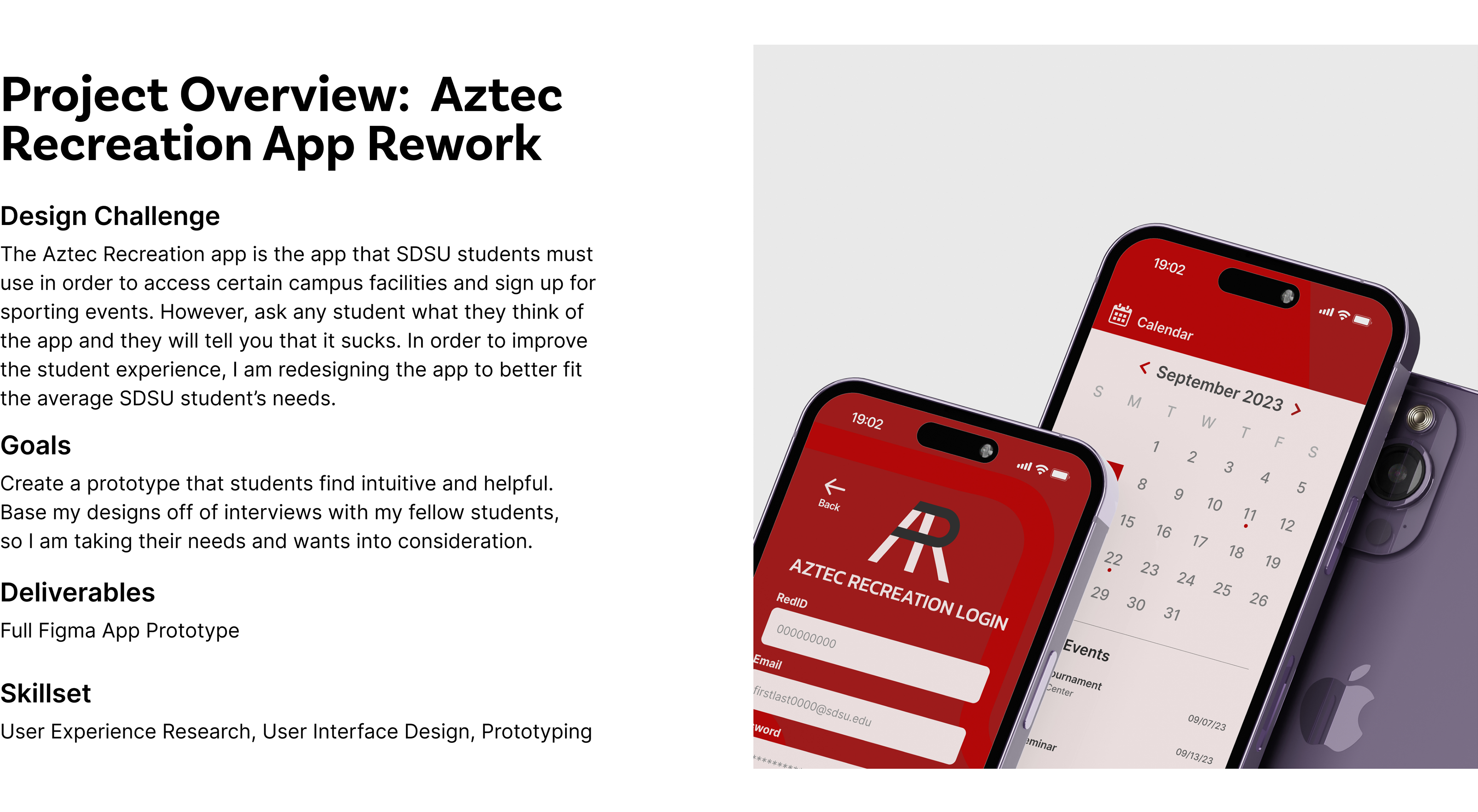

Aztec Rec Redesign Case Study
To start off my design process, I interviewed students about their experiences with the current app.
To go more in depth on my user testing questions and takeaways, explore my Figma file here! I interviewed three students as well as conducting a group interview to gain insight on student experiences.
The main problem users faced was that they could not access the barcode easily.
In order to access the gym facilities on campus, students must first load up the Aztec Rec app and scan a barcode. This was the most used function by far with many users opening the app every day just to do this. However, many users reported that they experienced annoyance or difficulty when accessing the barcode due to long load times and unintuitive navigation.
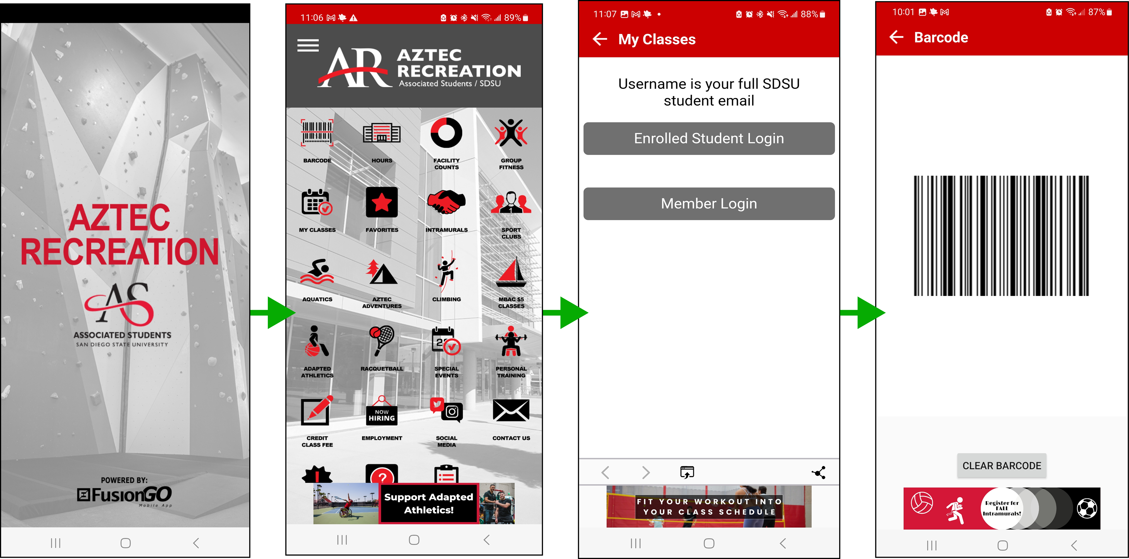
This was due to faulty design decisions that buried the location of the barcode.
In the old app, you would have to load into the home screen, click on the barcode button, load into a different screen, and then click on a button to load the barcode. Due to the sheer amount of content on the home screen, it made loading take from 5 to 15 seconds. It also made so finding whatever button you were looking for a nightmare.
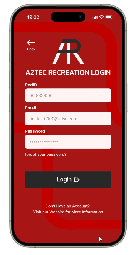
To correct this, I focused on designing the barcode to be more accessible.
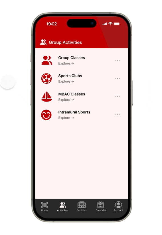
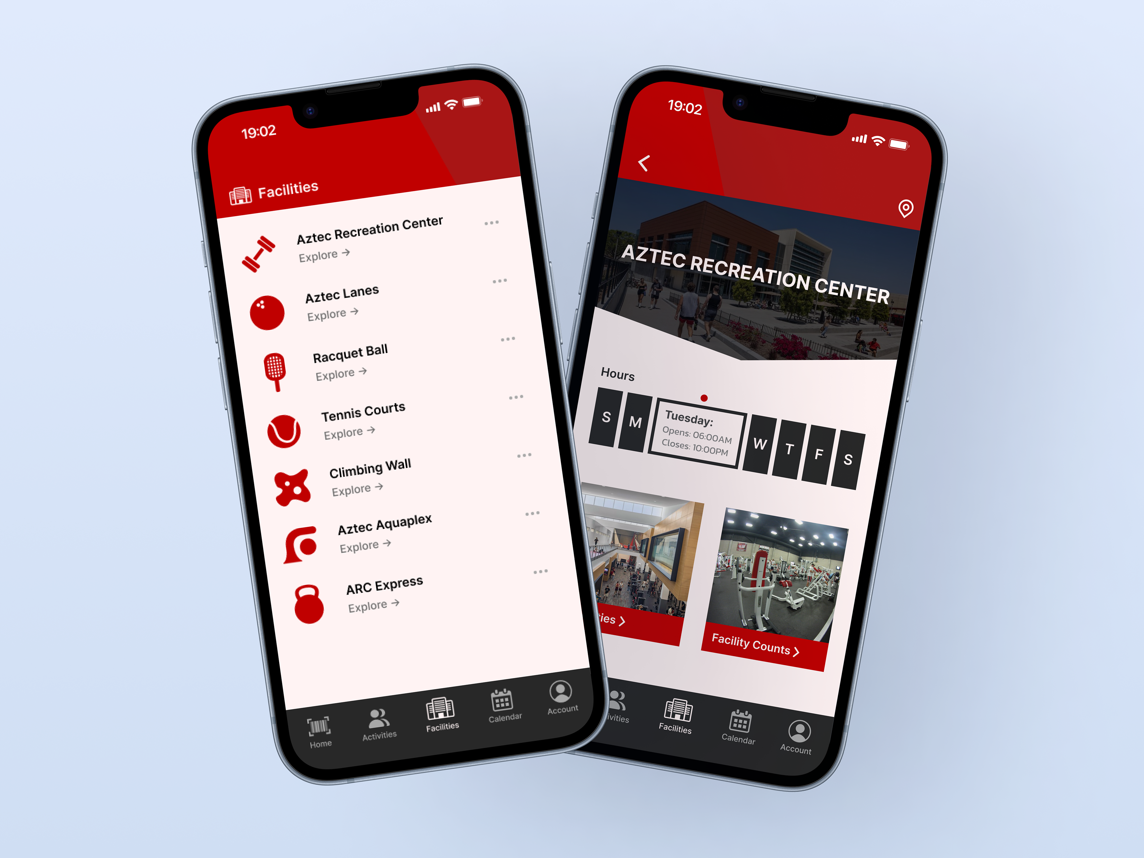
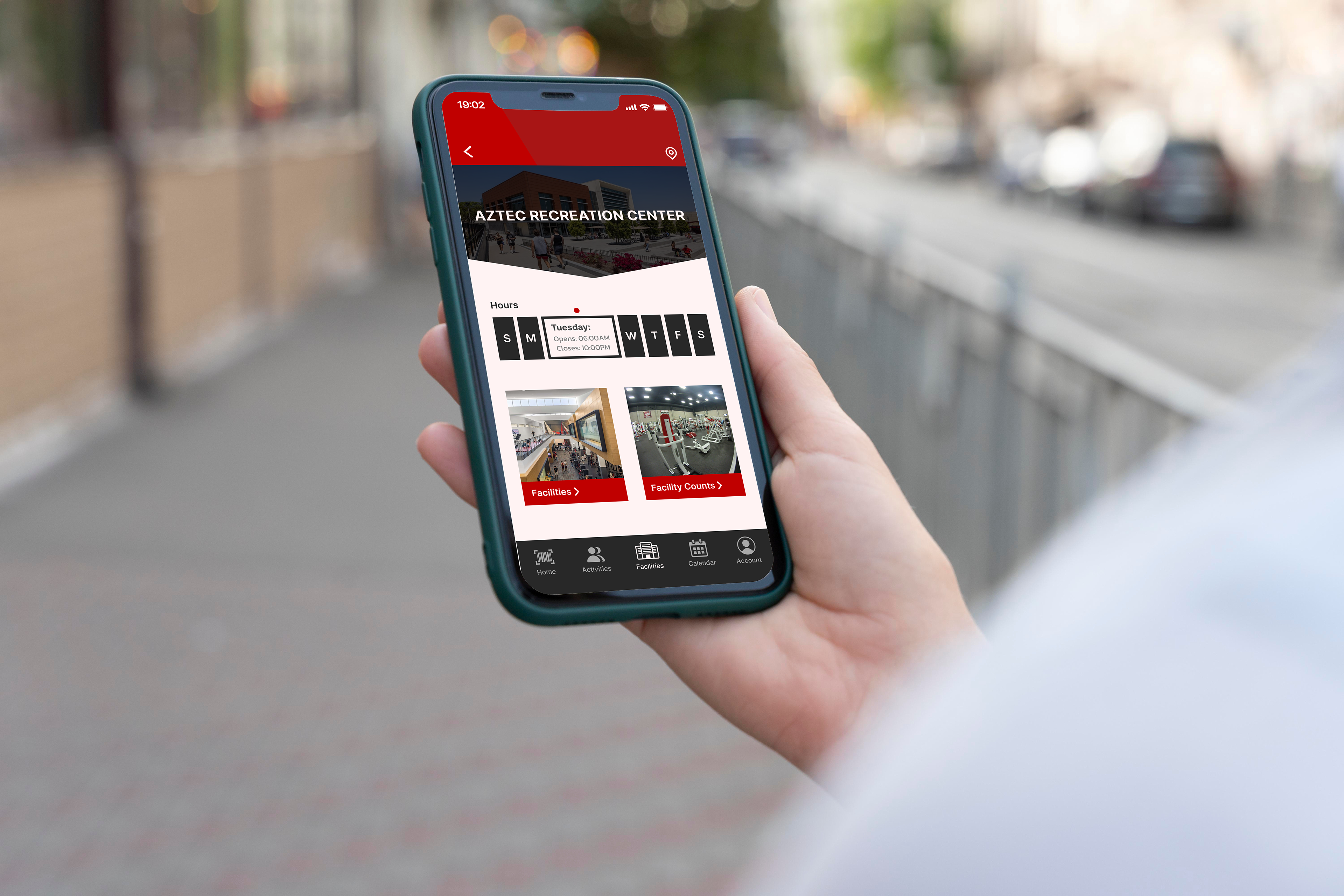
To do this, I put access to the barcode on the home screen as a big red button. This made it so that whenever someone opened the app the barcode would be right in front of their face, making accessing it easy and intuitive. I also severely decreased the amount of content on the home screen and spread it out more evenly across different sections of the app. This makes it so that loading into the app takes less time, making the user experience smoother.
My Design Process
Personas

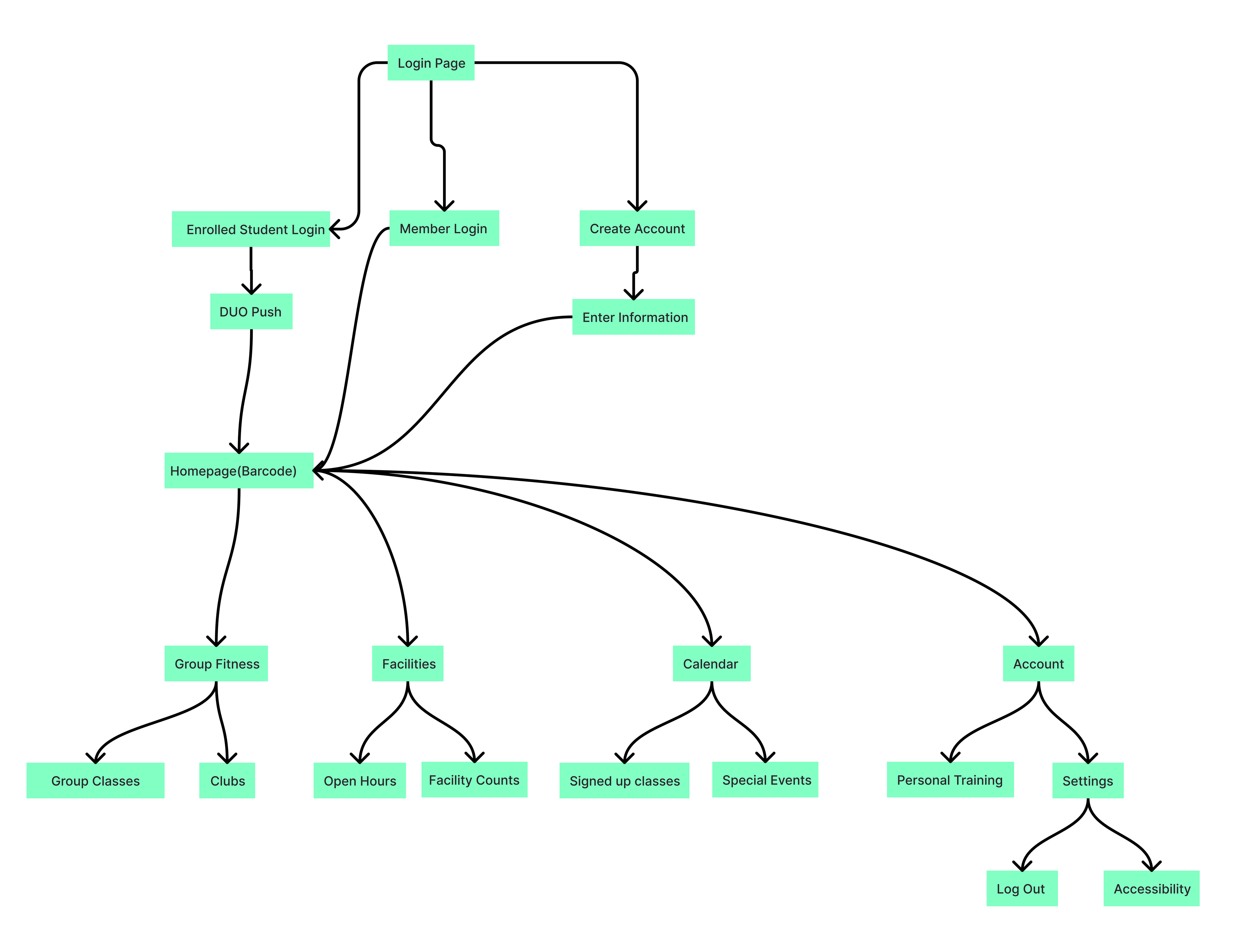
Flow Map
After creating personas for potential users, I created a flow map that charts out how users would navigate the app. This was so I could pinpoint how long it would take users to access the features that they use the most. This allowed me to make sure that the user's experience was very intuitive and made them feel comfortable and familiar with app.
Wireframe
Based off of the flow map, my grayscale wireframe was a way for me to plan out how I was going to design the content onto my screens. Zoom in to check it out!

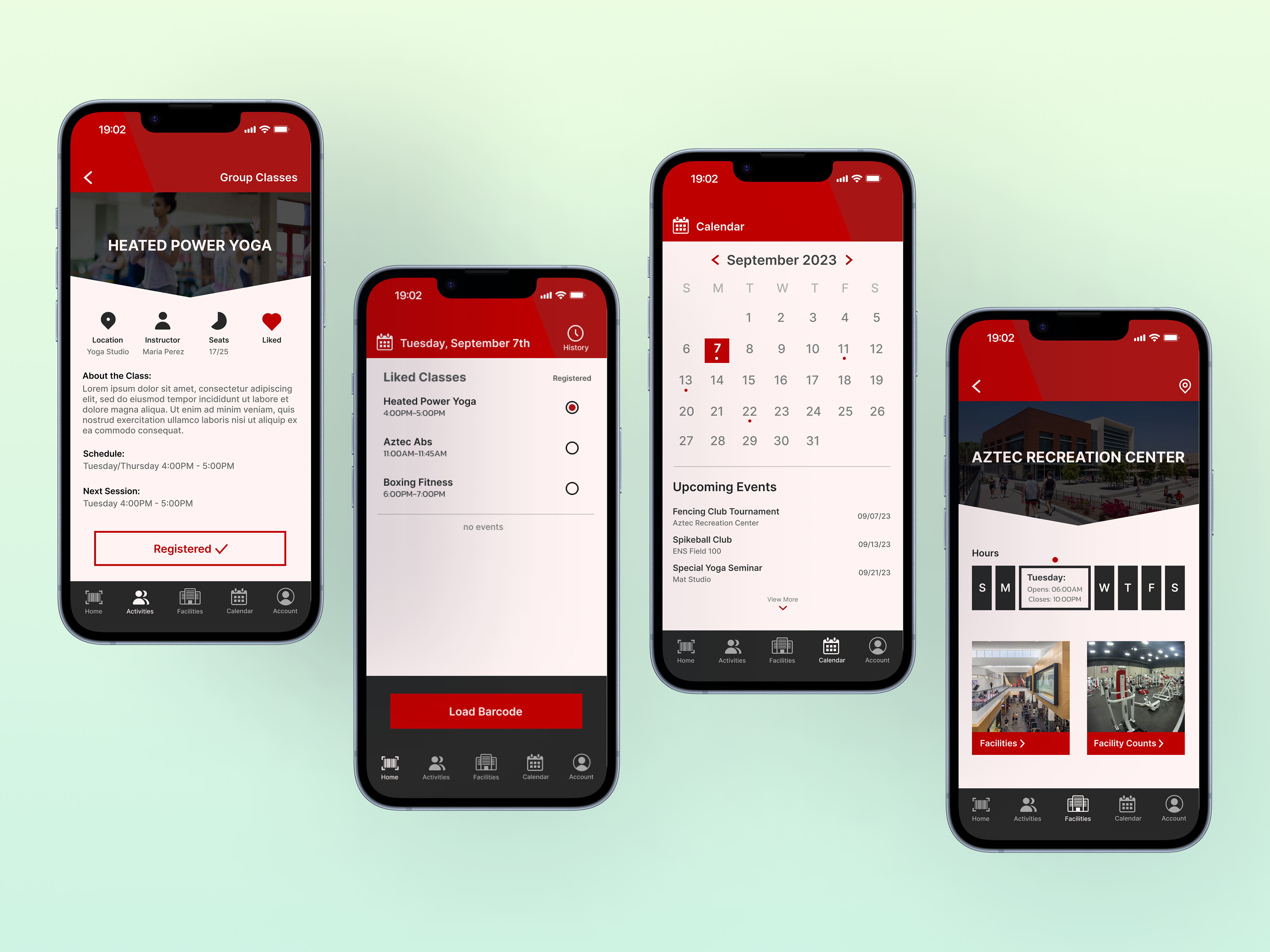
Final Product

Prototype