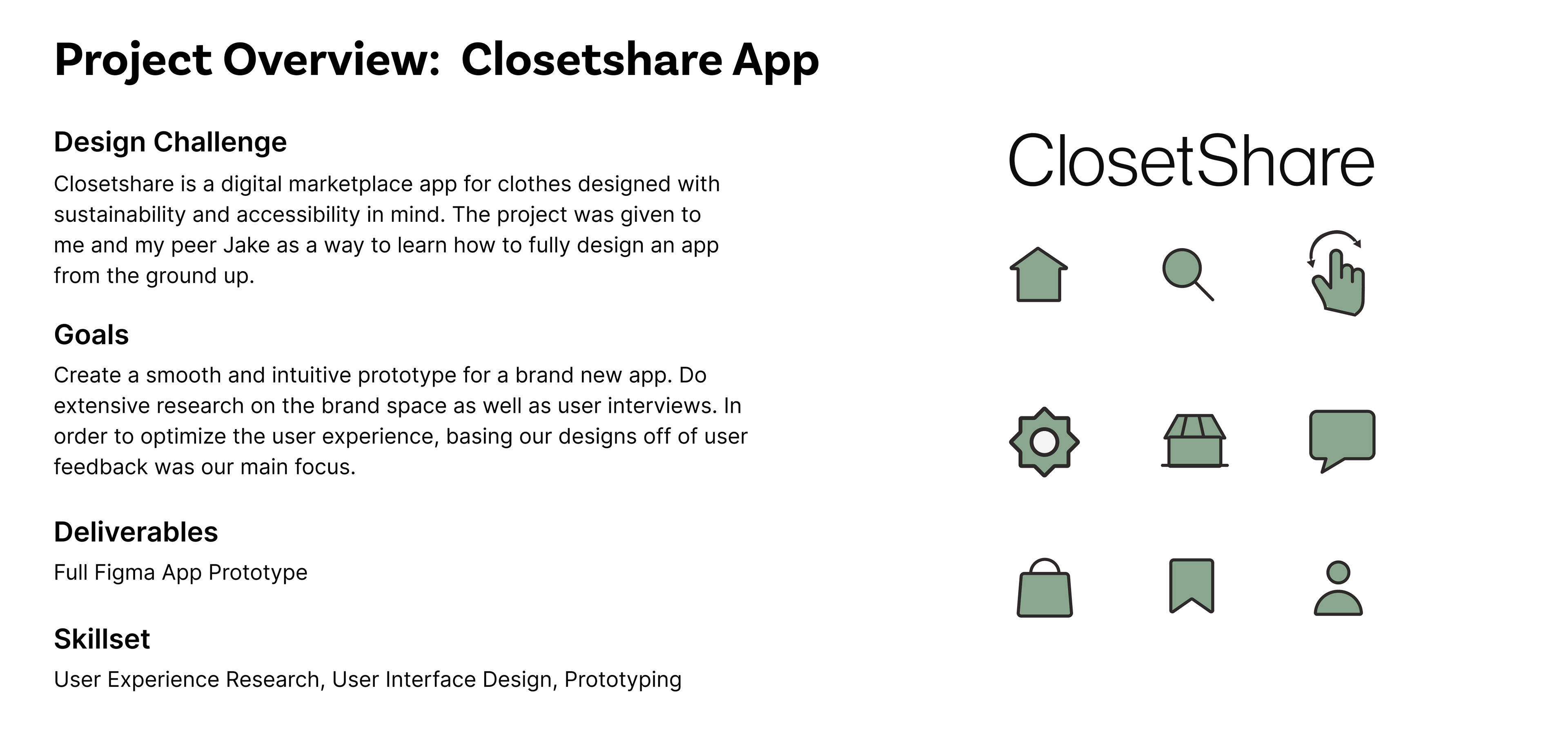
Closetshare Case Study
To start designing our app we analyzed a competitor, Depop, to see what design decisions they made and how to set ourselves apart.
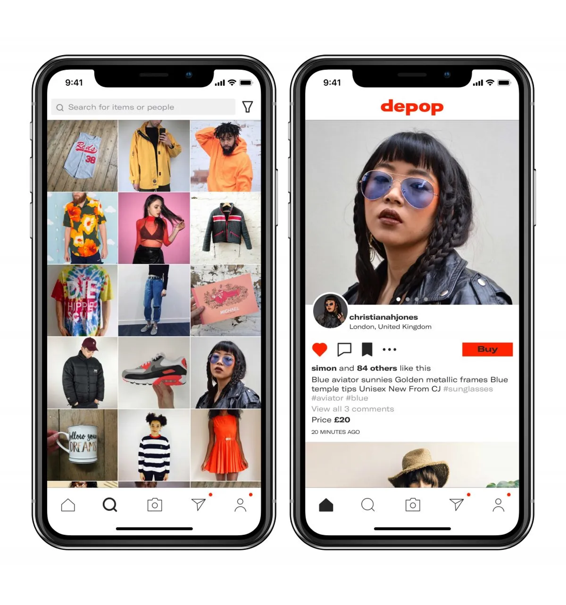
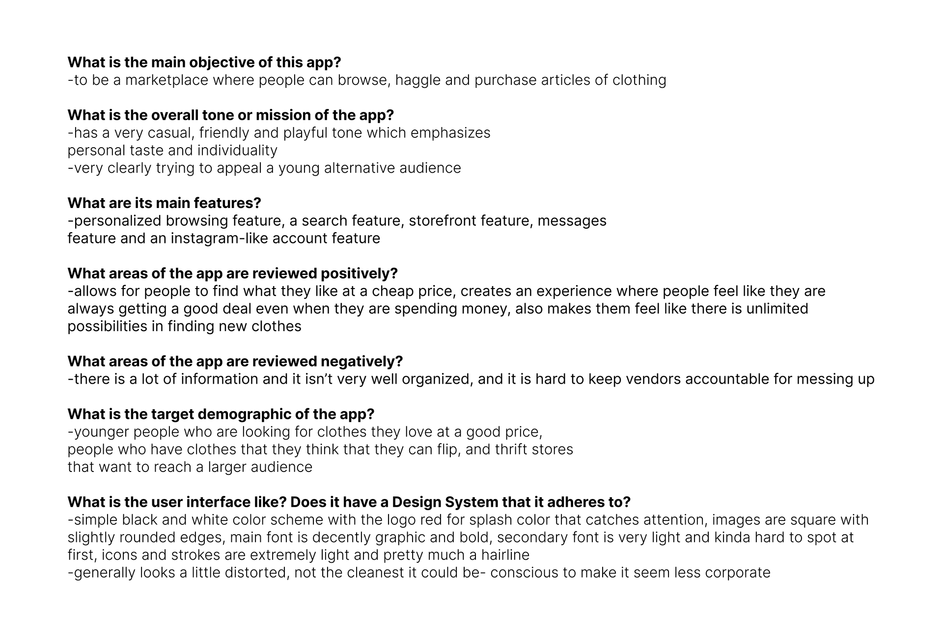
Next, we interviewed Depop users to see what they liked and disliked about the app.
We interviewed 4 users of different age groups and demographics in order to analyze a wide range of opinions of Depop users. This was to best understand the different viewpoints a user could view our app through, and to find problems in their experience to solve. Zoom into our prototype to check out our process!
A common theme we found was that many Depop users had encountered scammers and lost money.
The most common concern among the people we interviewed was that they wanted more accountability for the scammers. They also wanted there to be more transparency for sellers, as well emphasizing the importance of reviews.
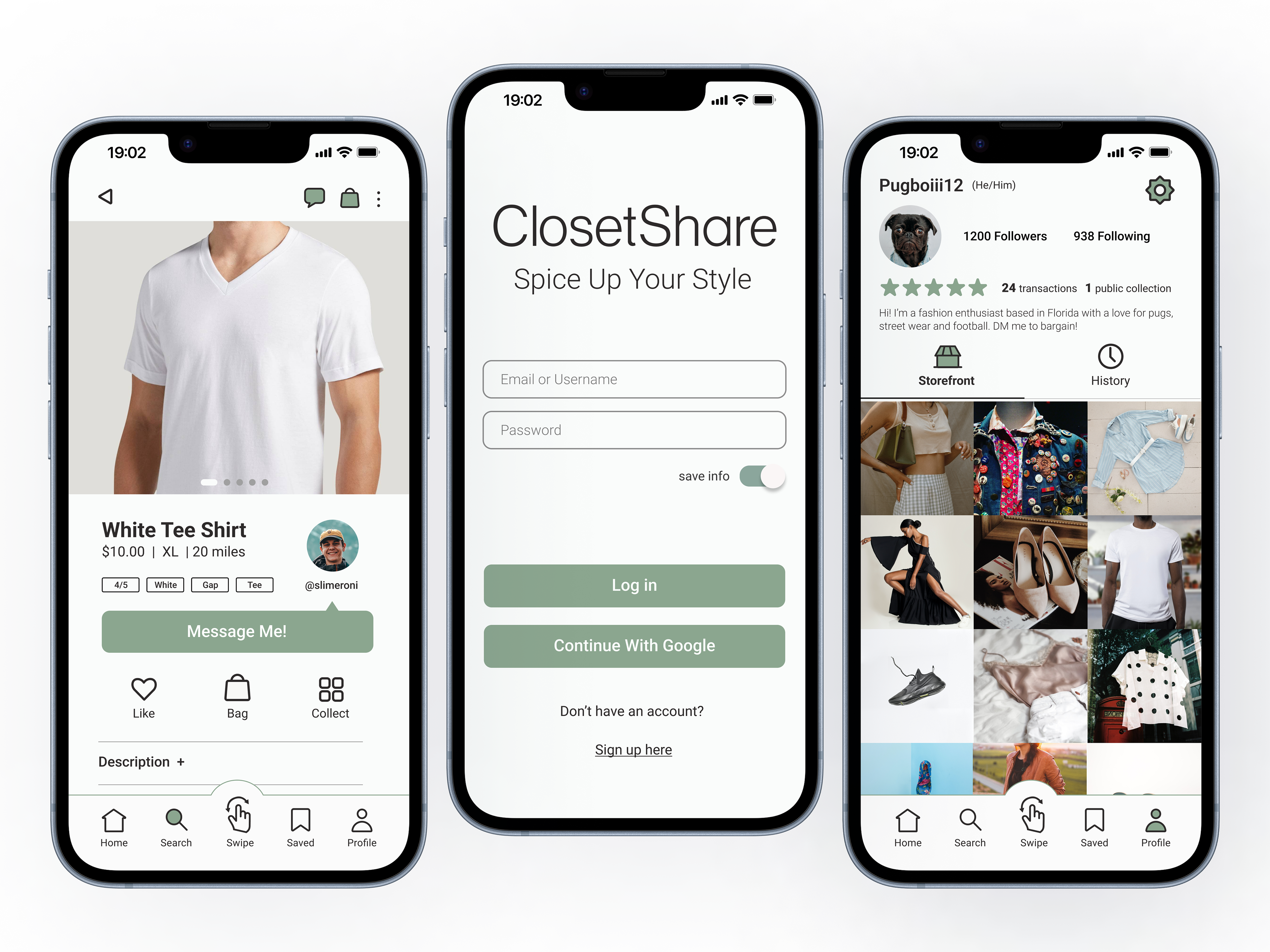
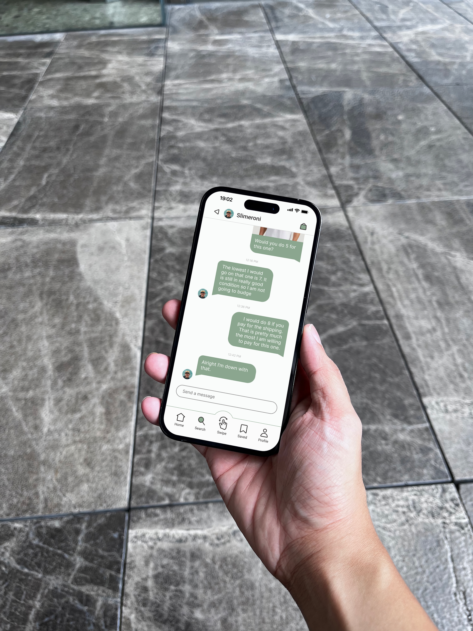
To make users feel more secure, we implemented a reliability rating system attached to the reviews in order keep sellers in check.
We wanted the user experience for Closetshare to feel safe and have users feel 100 percent sure that when they used our product. This is why it was so important to us that users are able to see the reliability before making a purchase.
Our Design Process
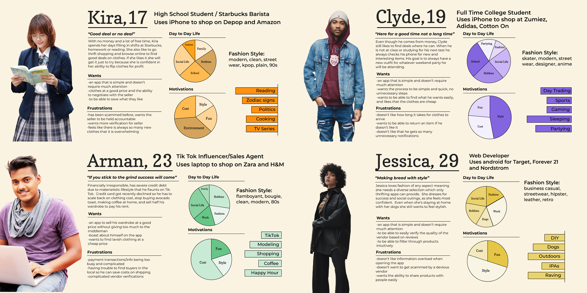
Personas
User Flows/Napkin Sketches
After doing research on what problems users were facing and how they like to tackle these problems, we created a flowchart for how users would navigate the app. This would allow us to better plan out pathways for users to take in order to make their experience the most efficient and satisfying. Zoom in to check it out!
Wireframing
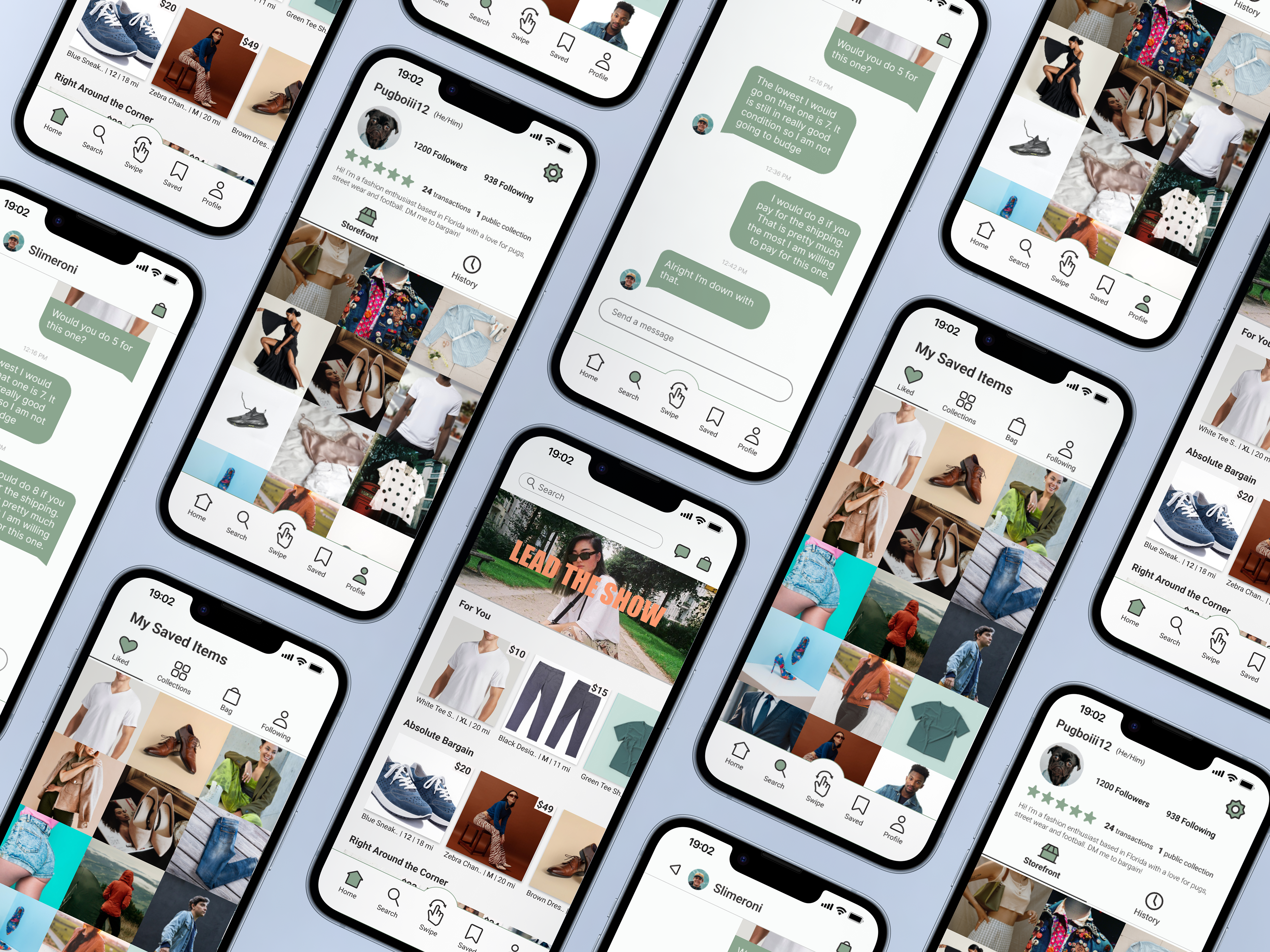
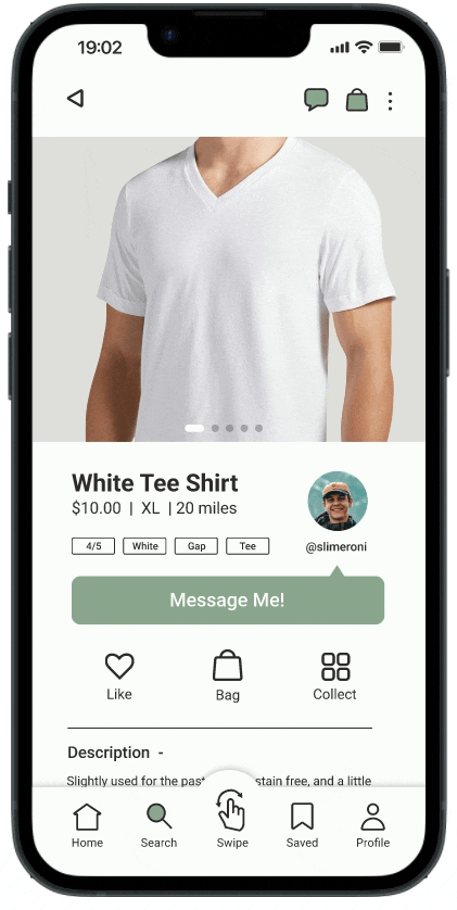
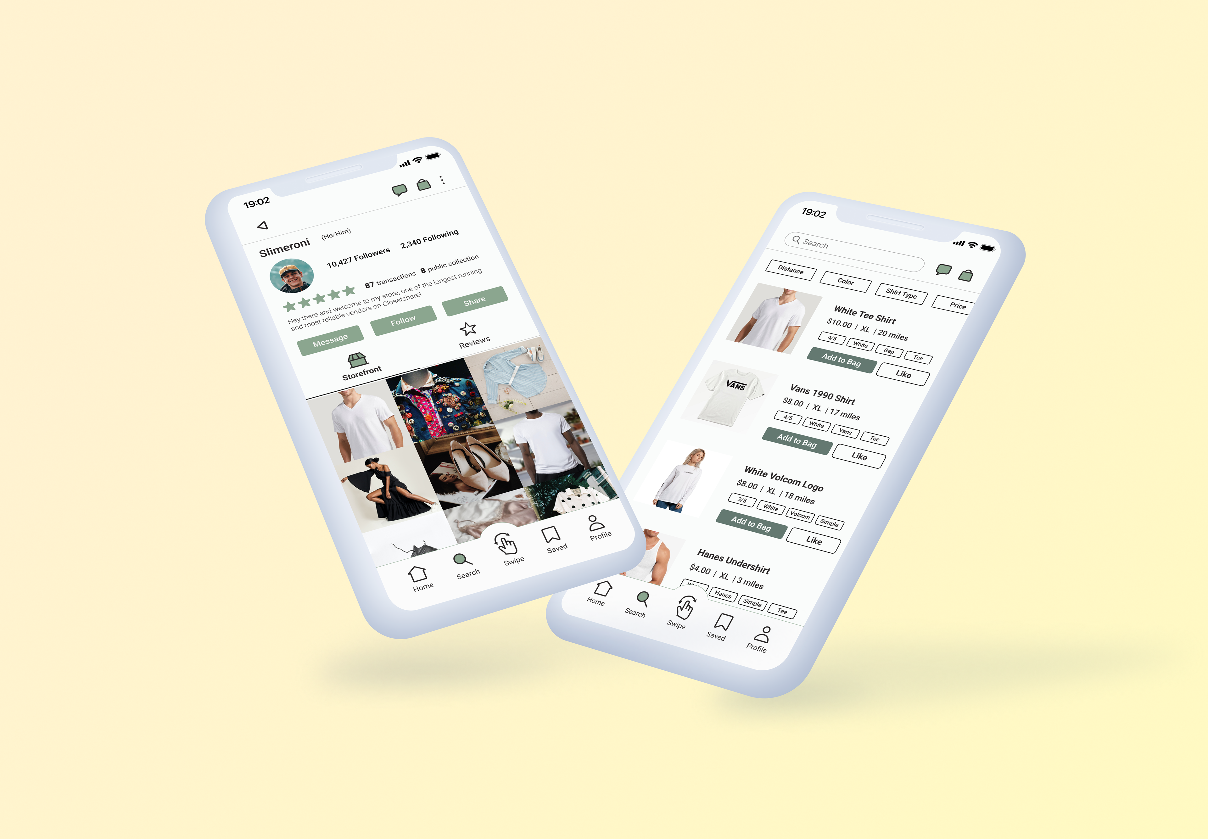
After planning out our user flows with the napkin sketches, we fully fleshed out a greyscale wireframe in order to plan out where our content was going to go. This allowed us to get everything we needed on screens and gave us the opportunity to test our concepts and make sure they were understood by users. Zoom in to check it out!
User Testing and Prototype 1
The most important part of our project was making sure that users felt comfortable and confident using our app. Throughout the entire process we were continually interviewing users to ask them about pain points and features that they liked.
Our user testing went through three phases. The first one was during our Depop analysis, where we asked Depop users about things they liked and disliked about the app and took that into consideration when designing the personas and wireframe. After making said wireframe, we then asked another round of users to test it out and implemented the feedback we received when the first rendition of our first prototype. Our final round of user testing went into this prototype, where we asked users to tap through the app and give us feedback which we then implemented into our final product.
Go full screen and check out our prototype for yourself!
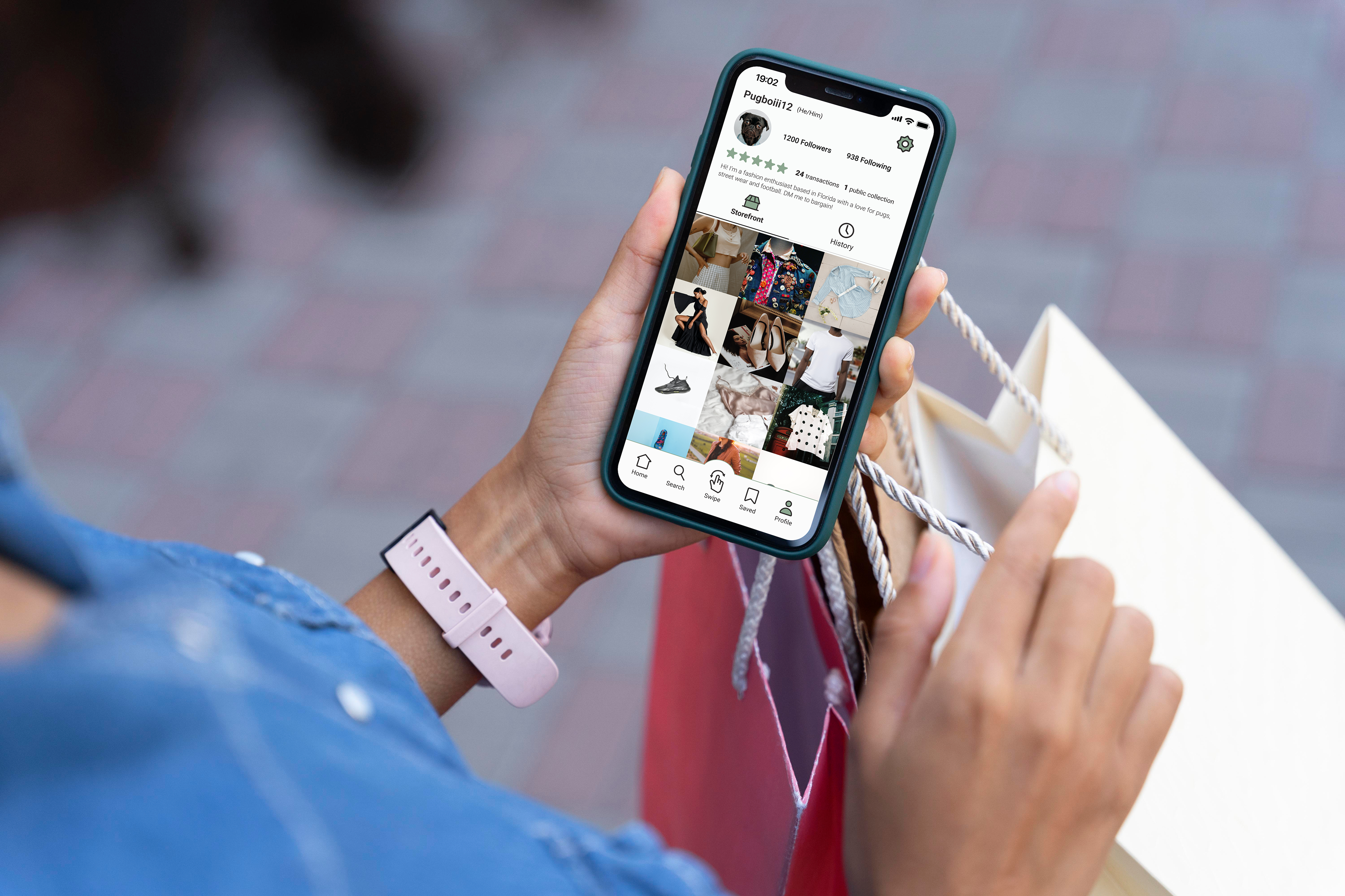
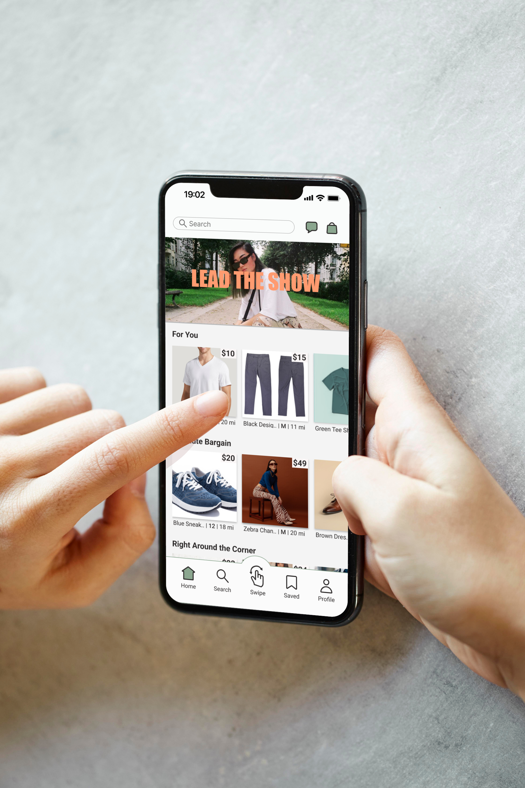
Final Product: Closetshare