
Image by mego-studio on Freepik
Process Work: Sketches
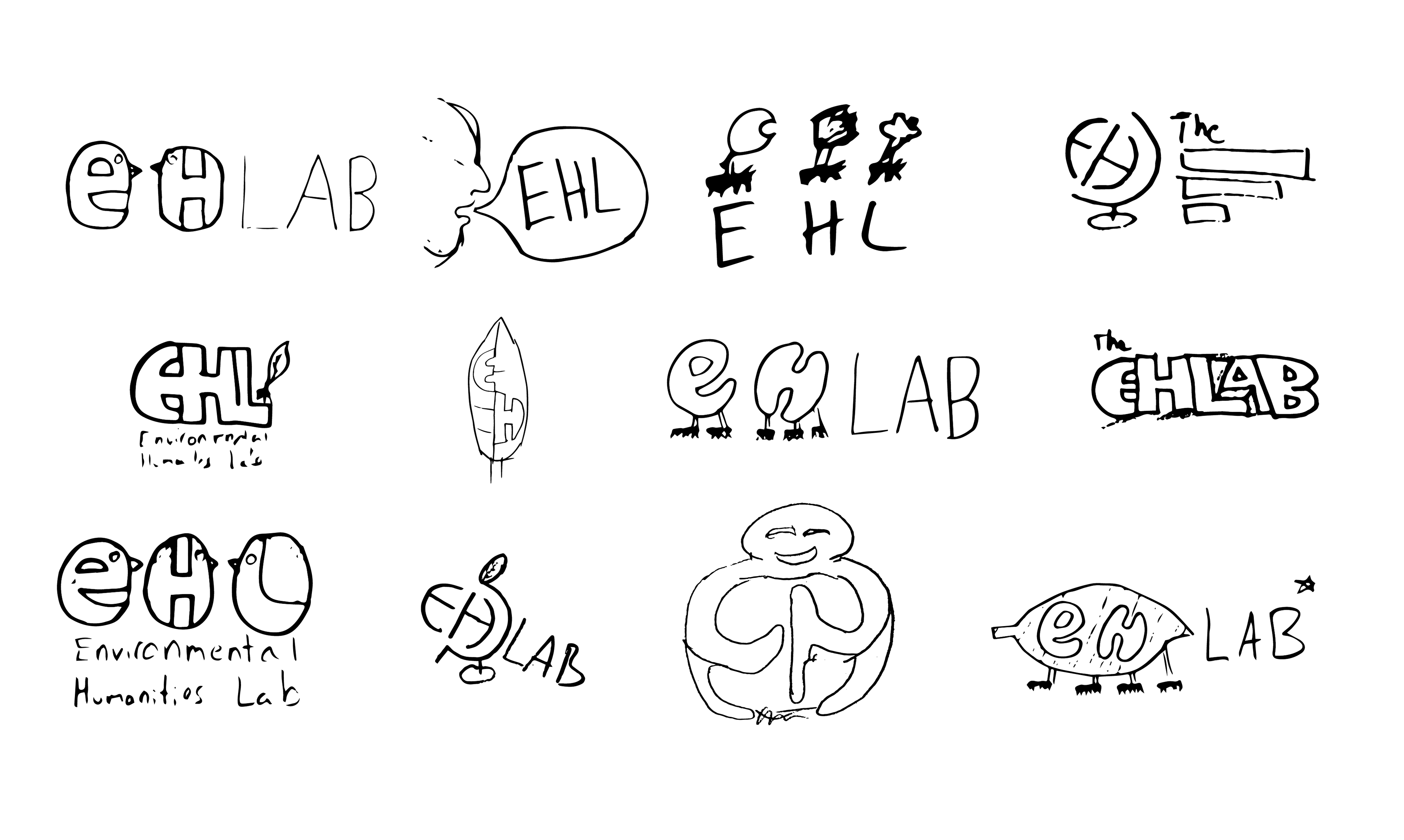
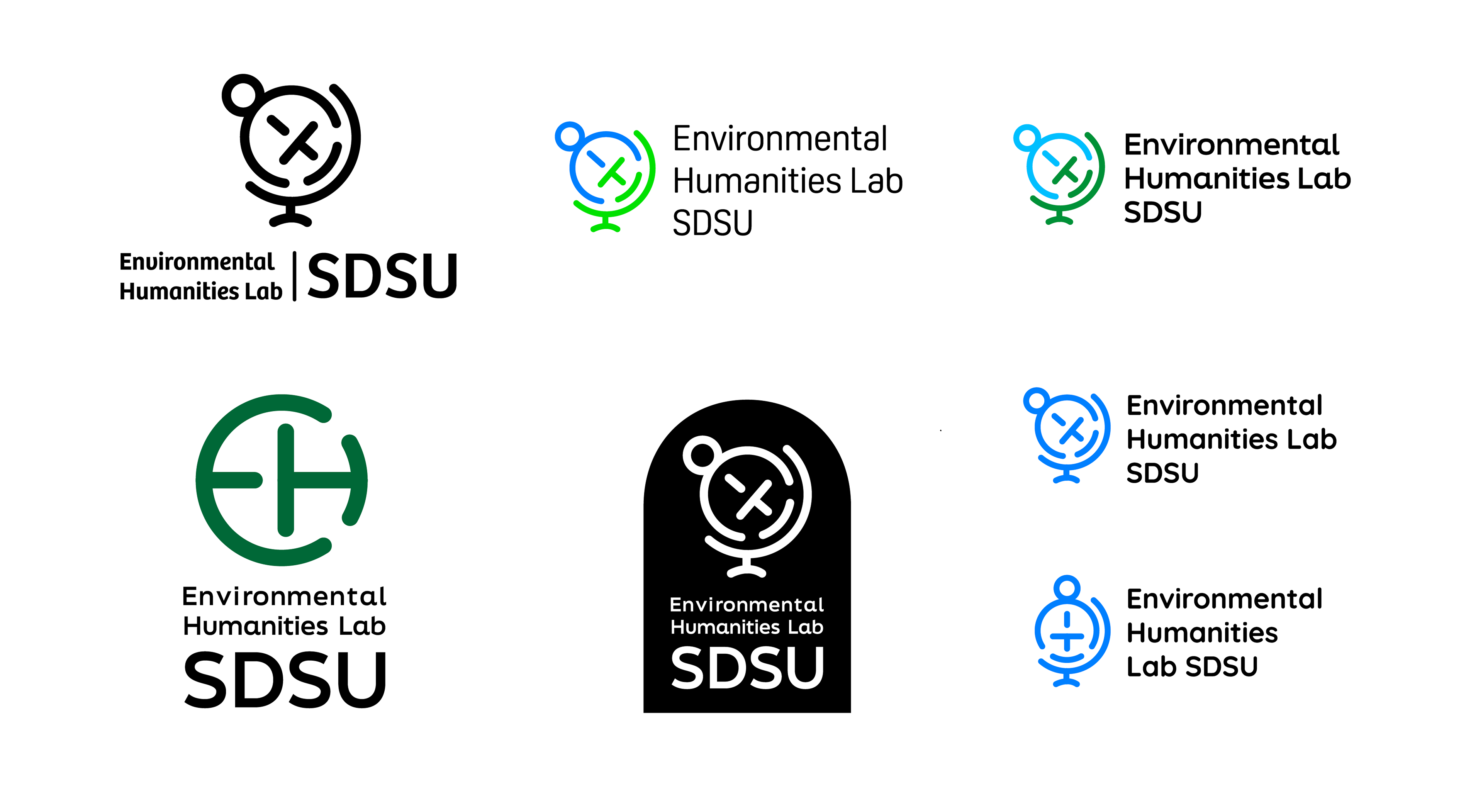
Process Work: Choosing a Direction

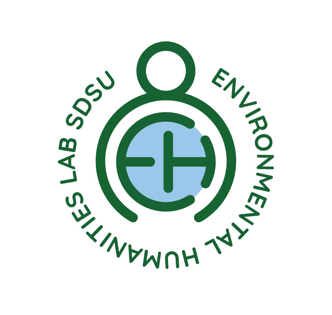
After exploring many different options and ideas, I settled on the concept of having an E and H combine to create a globe. I felt this was a clever and effective way to communicate the idea of the Lab being a space to solve environmental problems.
Process Work: Graphic Explorations

Process Work: Logo + Type Lockups
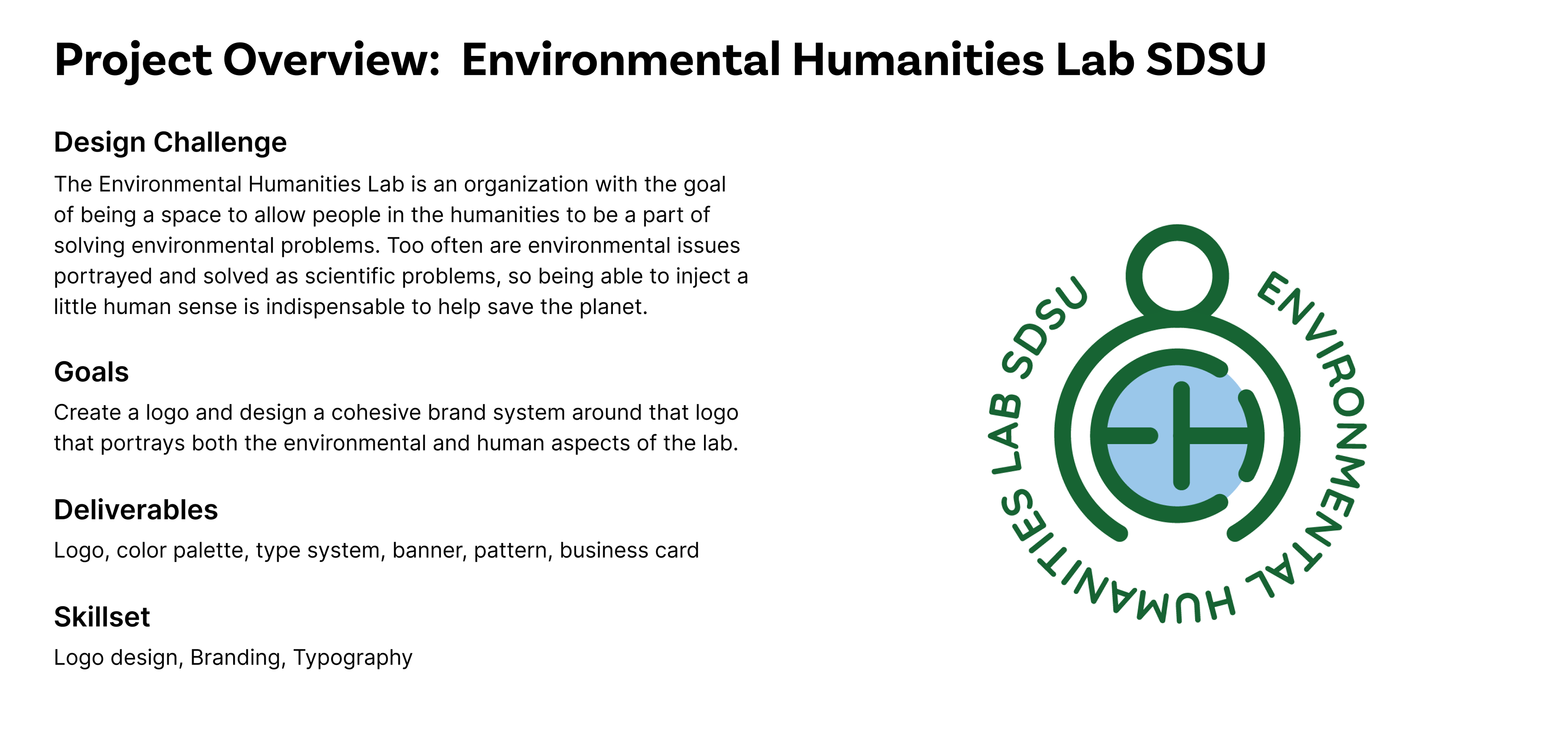
My Solution
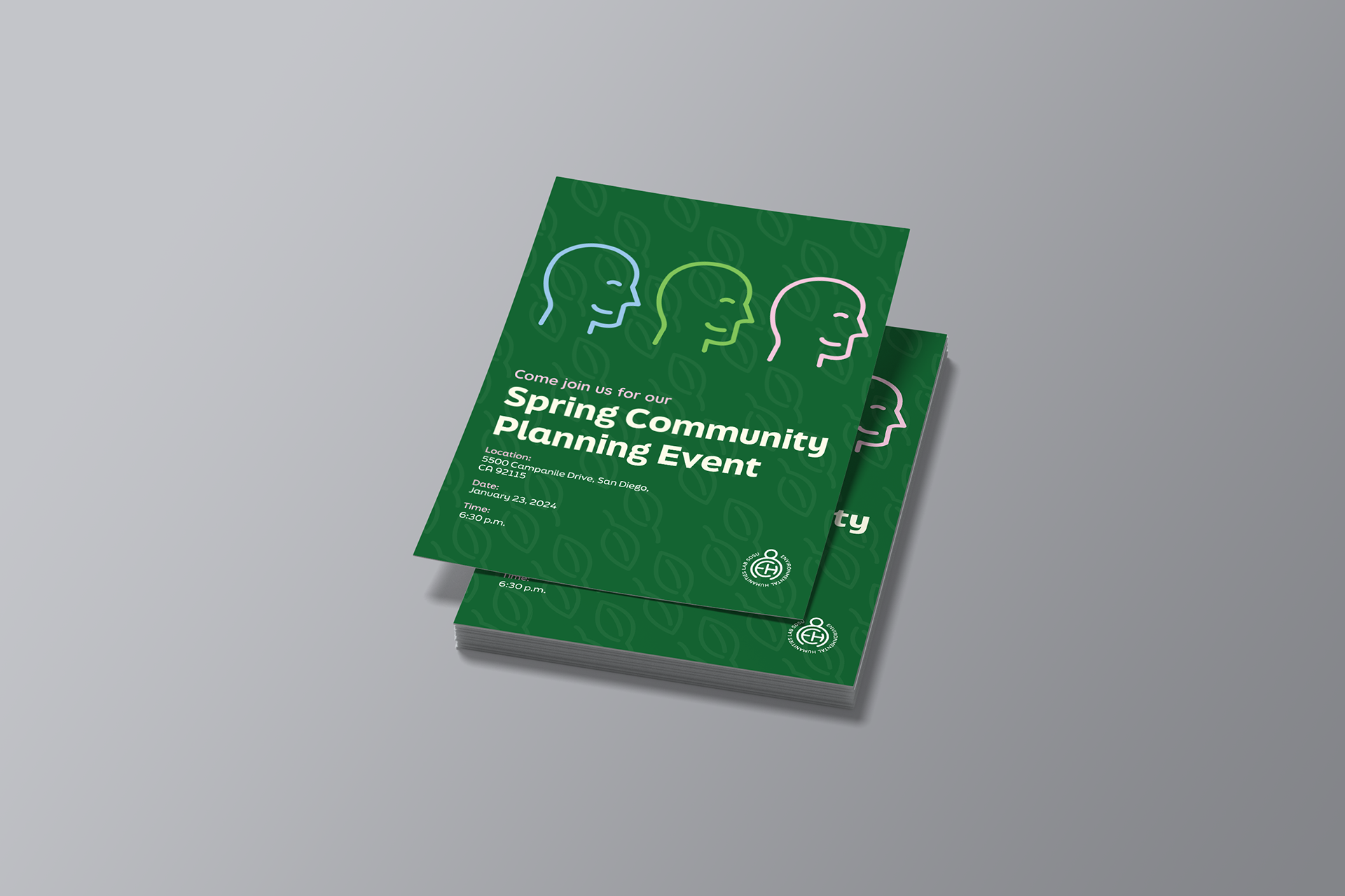
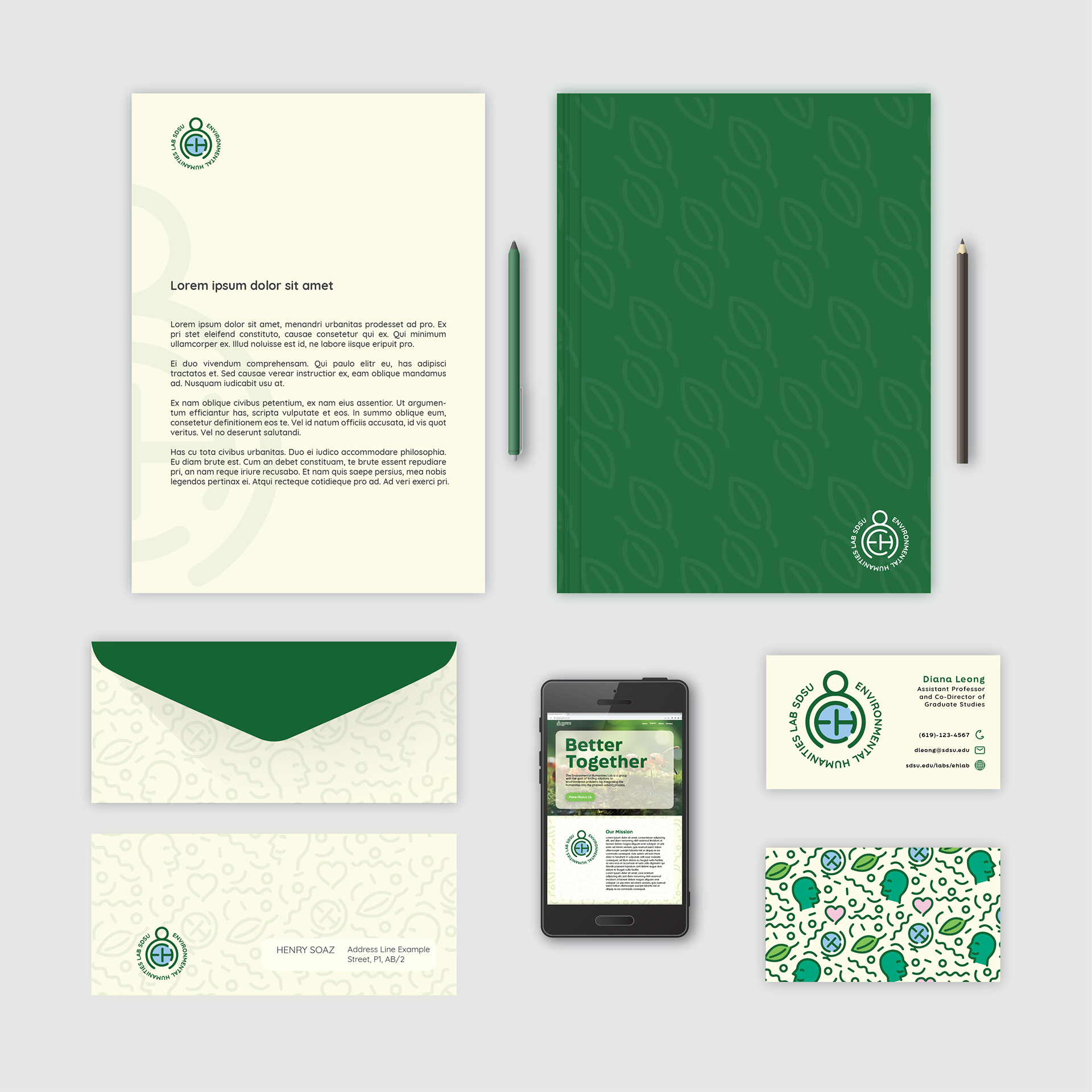
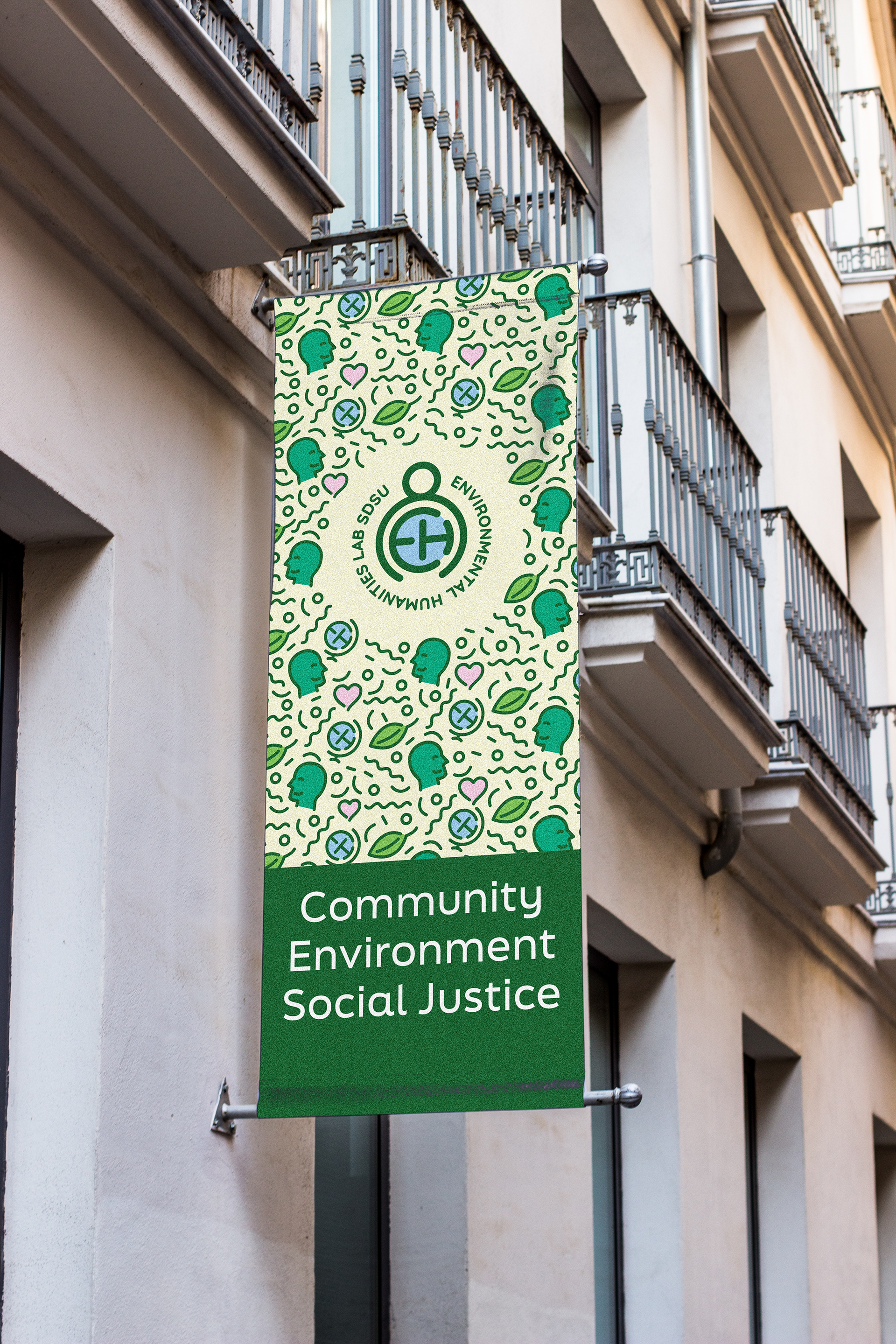
My logo solution for the EHLab has a person hugging the globe in order to show humanity’s compassion in caring for our planet. The globe is made up of the letters E & H, which stand for the Environmental Humanities. I chose to keep all of my lines rounded in order to have a sense of friendliness and chose the colors green and blue so it was recognizable as an environmental organization.
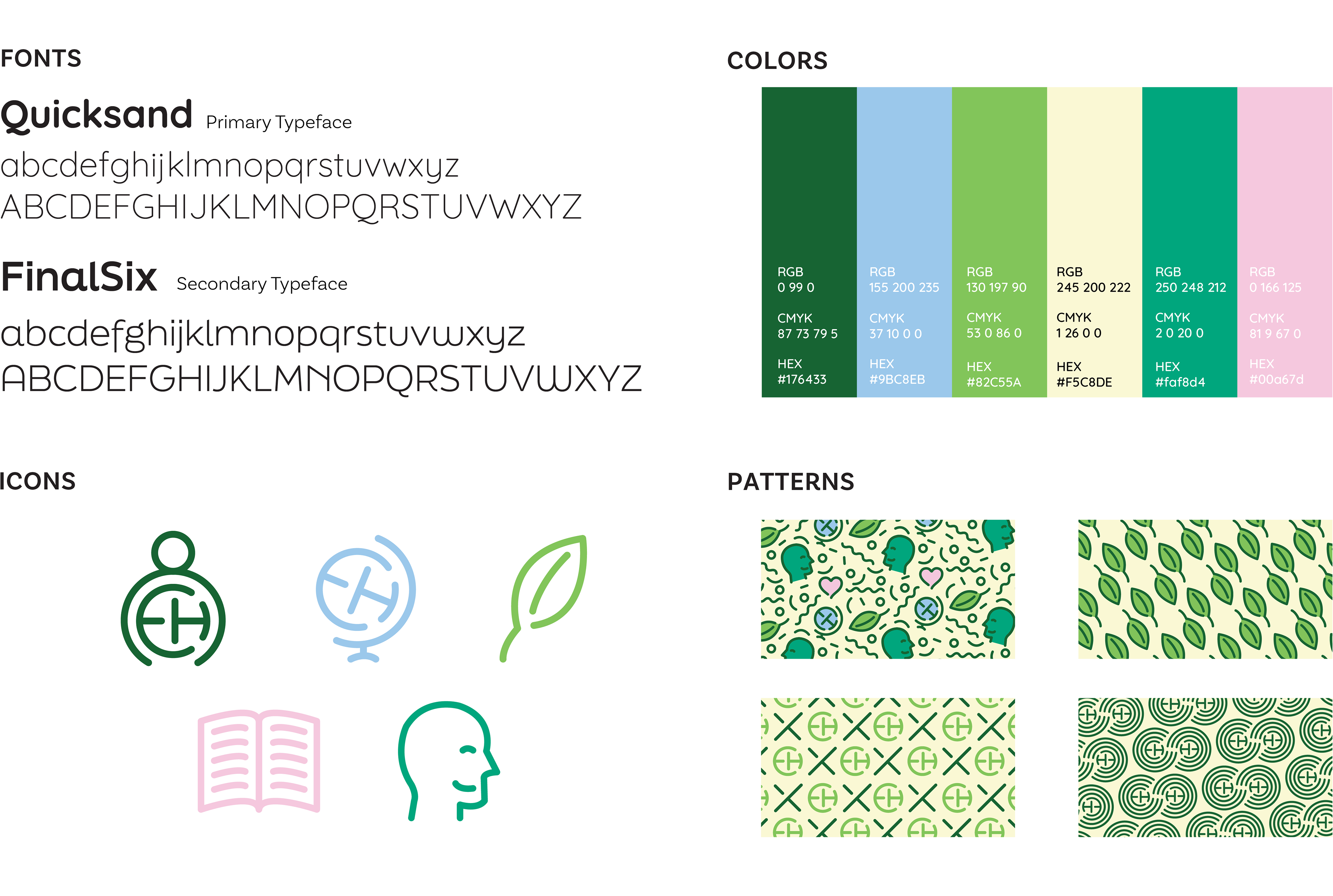
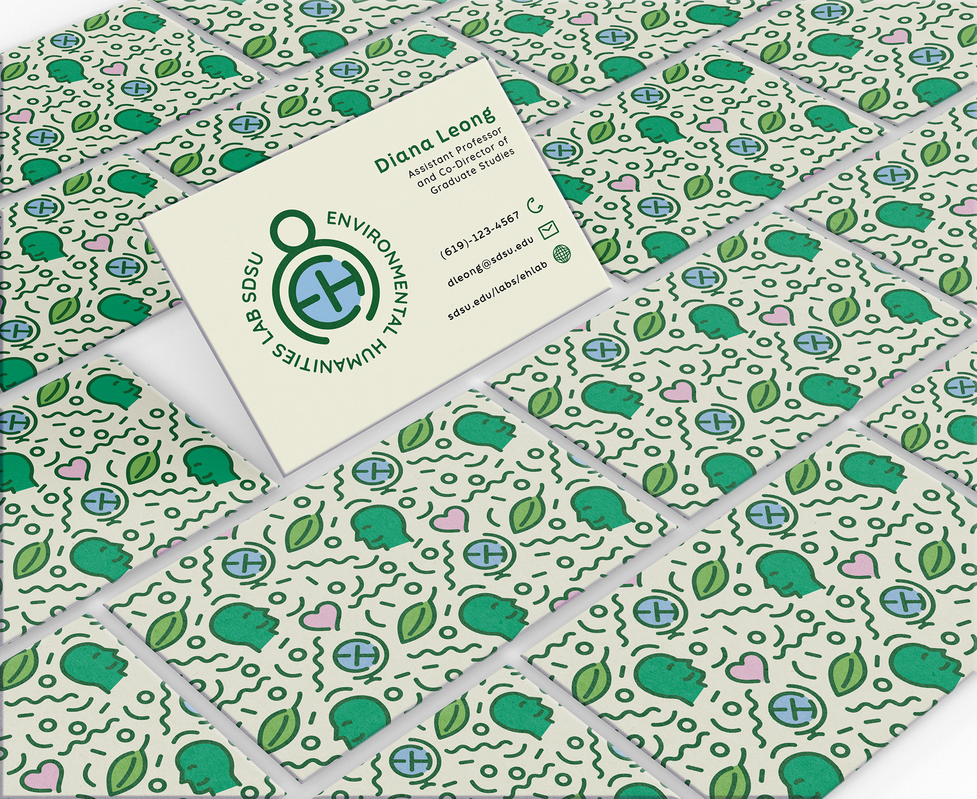
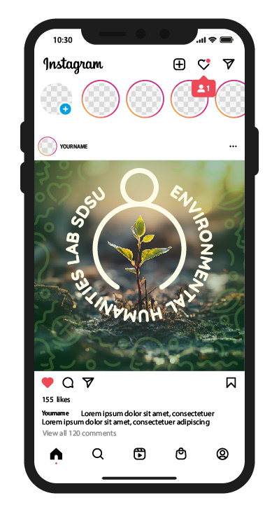
EH Lab Brand Guidelines