Process Work: Early Sketches & Poster Layouts

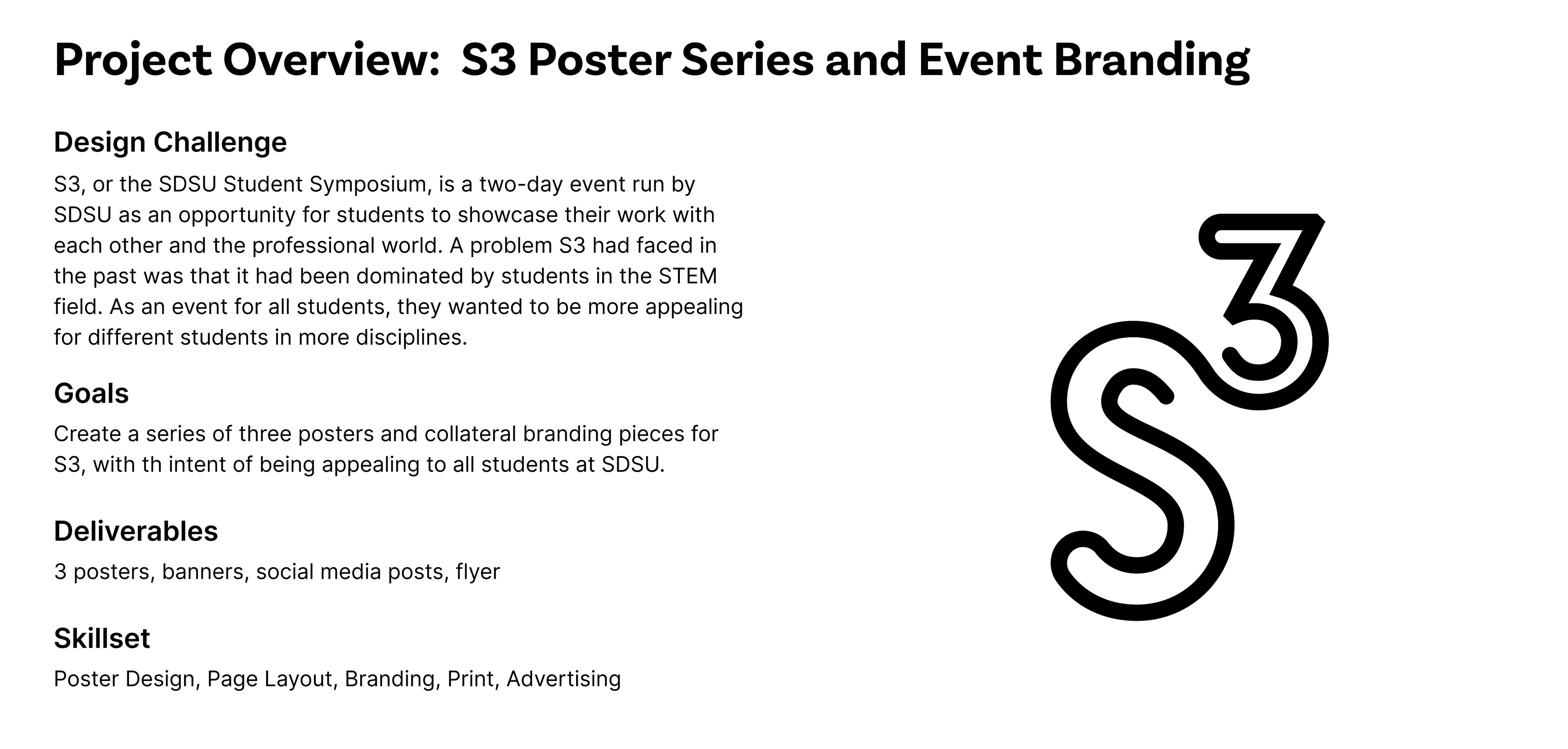
An issue that S3 had faced in the past was that it had been mostly dominated by students in the STEM fields. S3 strives to be a space for all students, so the organizers of the event wanted the branding to be more appealing to students in the arts and humanities.
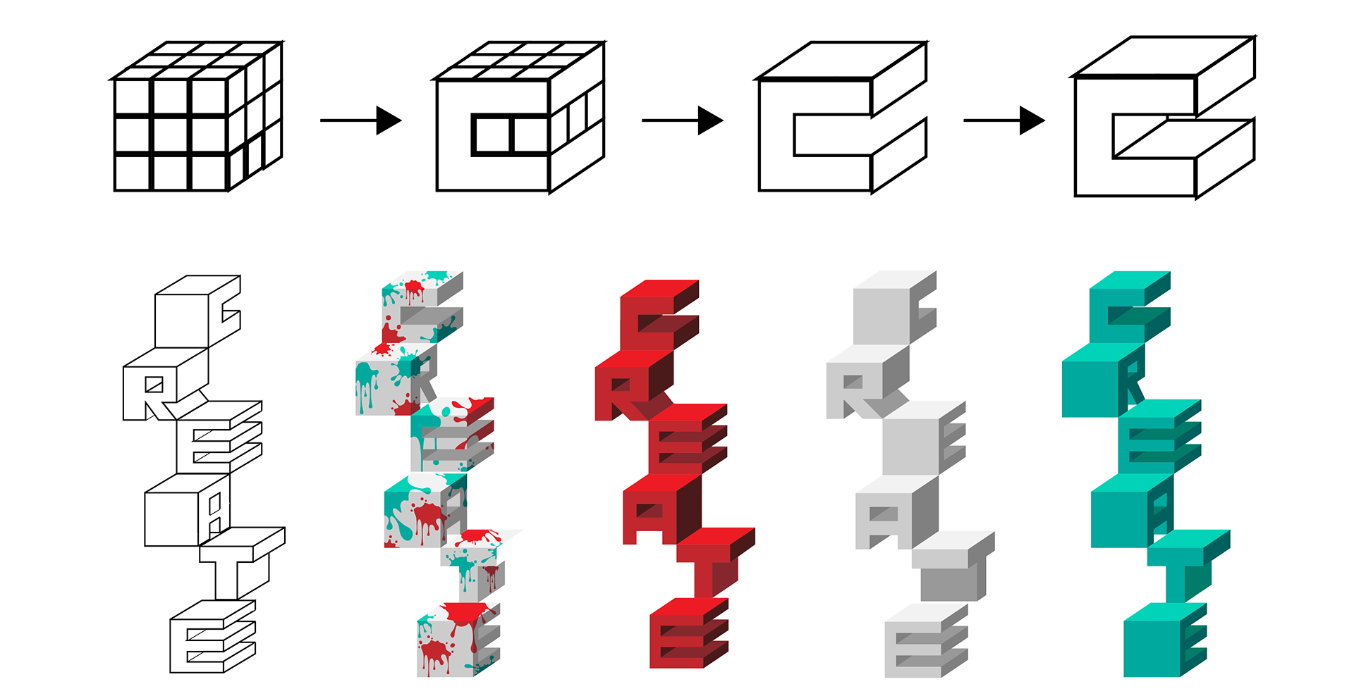
Process Work: Developing the Building Blocks
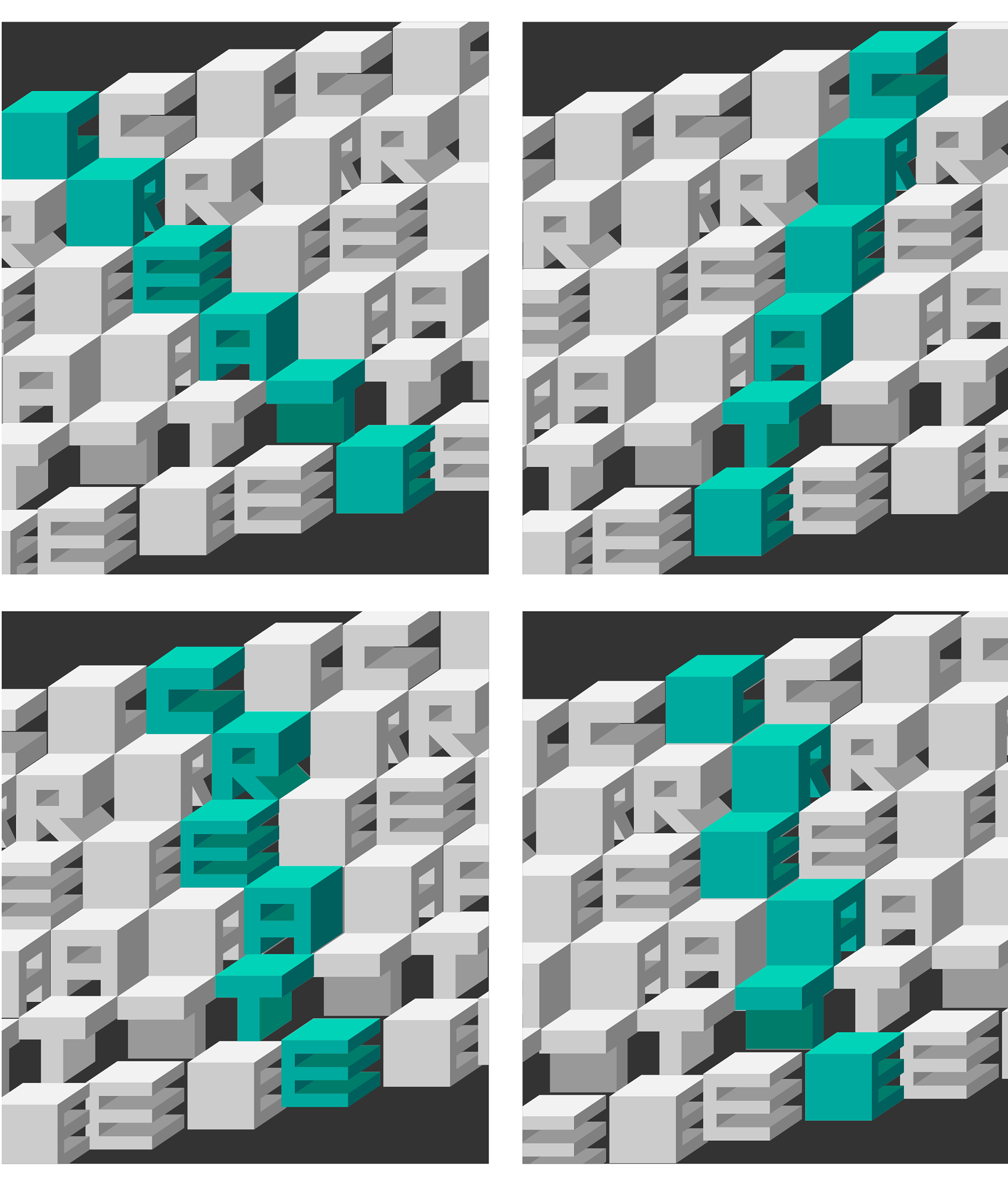
Process Work: Testing Orientation and Layout
Process Work: 3 Poster Layout Options

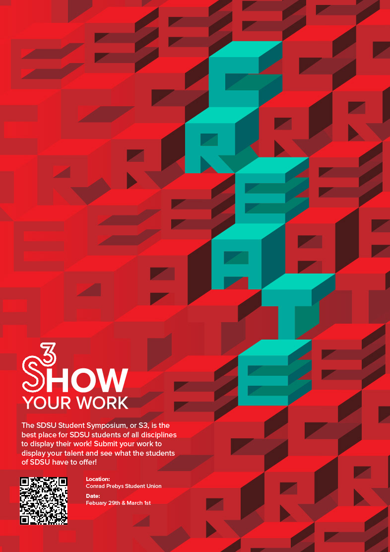
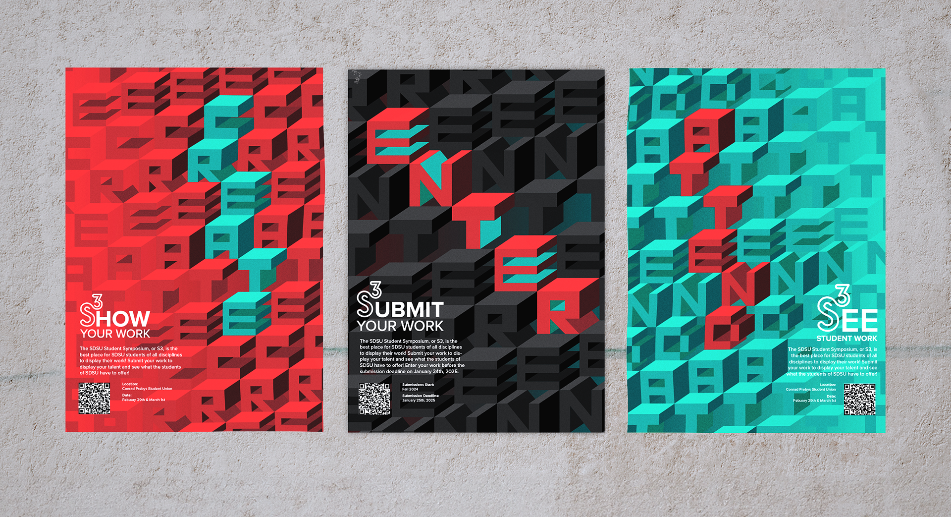
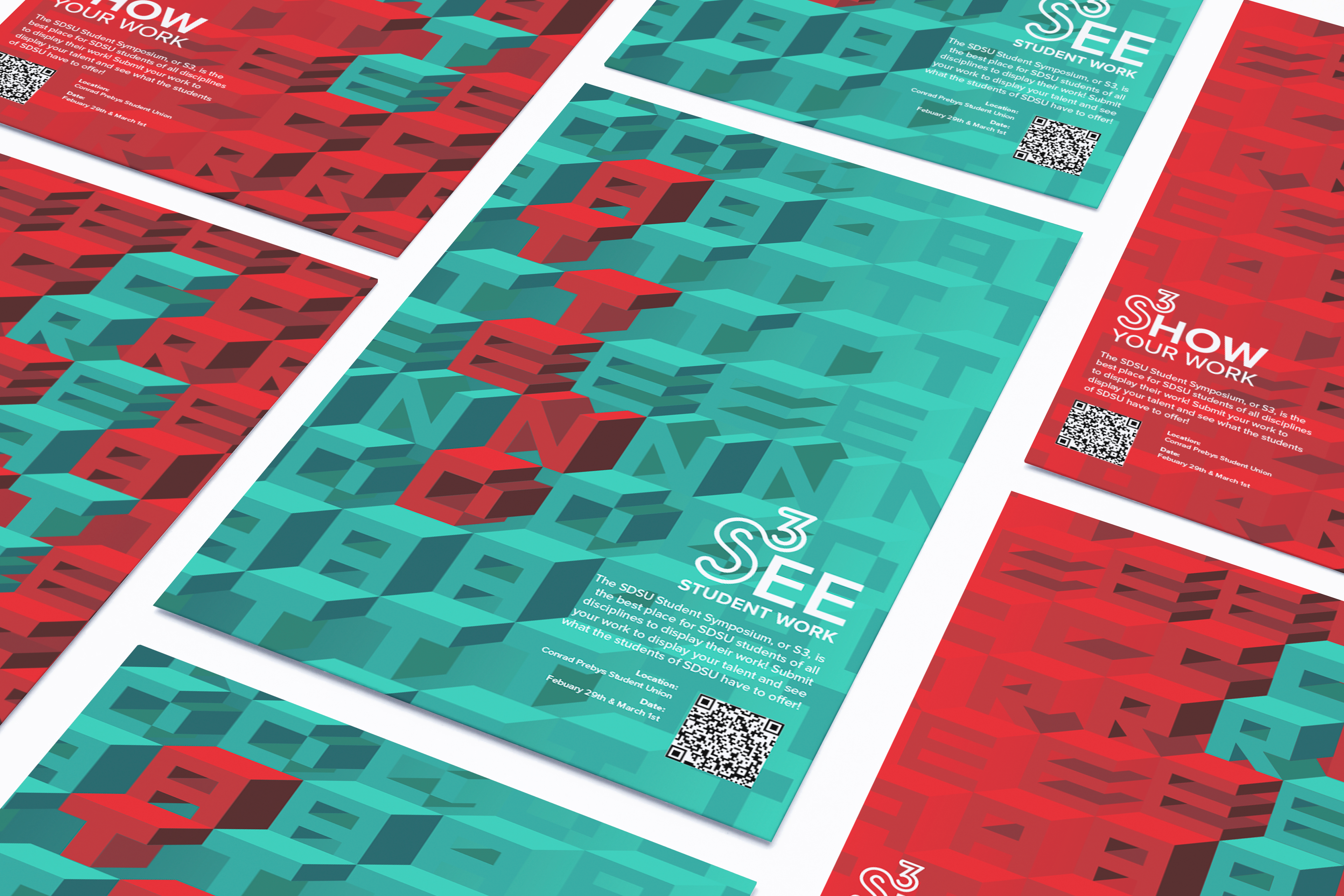
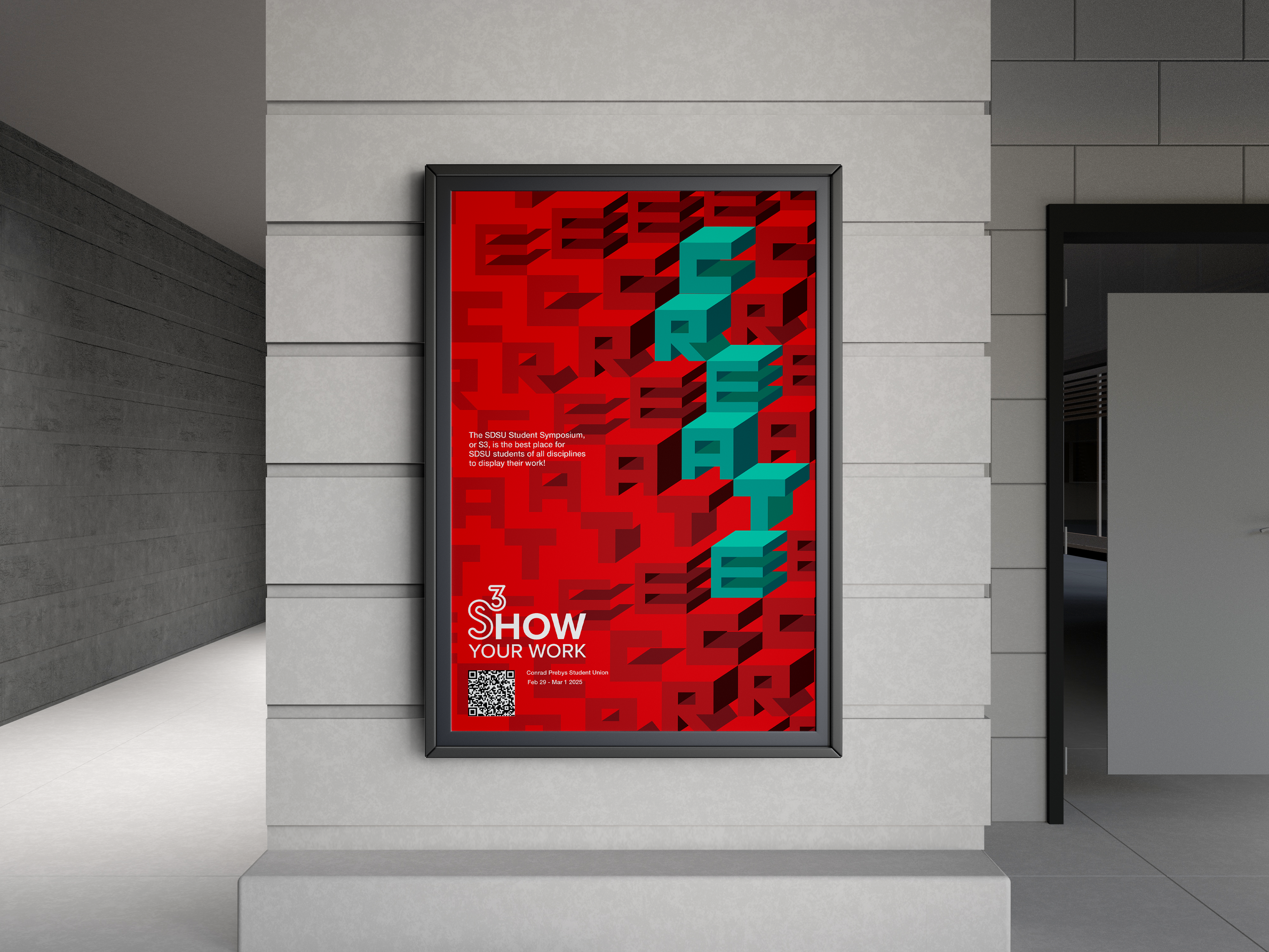
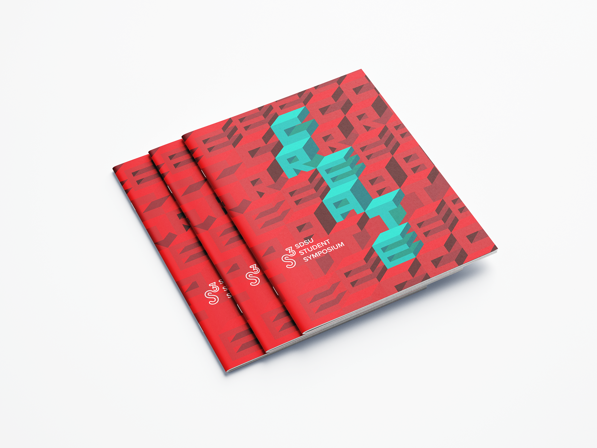
My Solution
The concept that I wanted to exemplify the most in my design is widespread appeal through simplicity. I did this in order to catch the attention of SDSU students of any major or profession, and so it would interest them enough to find out more about the event. I executed this by keeping the elements of my design simple and concise, using only geometric shapes and text. I also made sure to have the designs be instantly recognizable as SDSU, so I used only the colors red, teal, black and white to create that distinction. I did this so every student at SDSU would be interested and be able to relate to these designs, as they appeal to everyone through the visual language and don’t alienate any group of people.